After my mid process crit and taking on the feedback i think it was a good idea to take a step back from the complex shapes pieces i had done and try and explore a new process but still looking at the themes of balance and contrast. In my crit, exploring a 3D approach was suggested and the idea that i should maybe try a bit of sculpture. Sculpture is not really my favourite and i don’t really know how to think in a 3D manner. To take on the feedback i folded up the to of my small geometric pictures just to make it bit more interesting. Having the folds in the pictures makes some parts of the picture stick out and having it more 3D changes the way that we look and interact with the piece which i found really interesting. I didn’t really know how to develop that futher so i wanted to try something new and take a different look on my work.
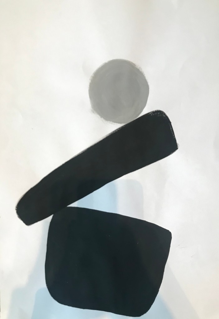
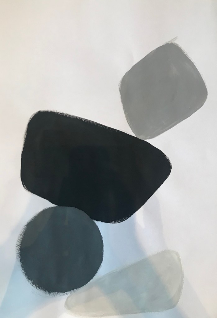
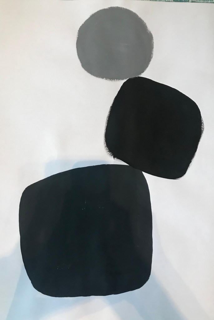
I wanted my work to focus on balance. I had previously looked at balance within colour and shape but i didn’t really look into 3D balance. I waned to create an illusion of 3D balance but in 2D. I started of by doing some research into balance and found Japanese Zen rock balancing which i really liked the look of how it doesn’t look real and looks like its going to fall over however also has a stillness to it and has a peaceful feeling. Taking inspiration from the rock balancing i didn’t just want to balance rocks i found as i didn’t really think that was really interesting and doesn’t really have much meaning so i wanted to explore this through painting.
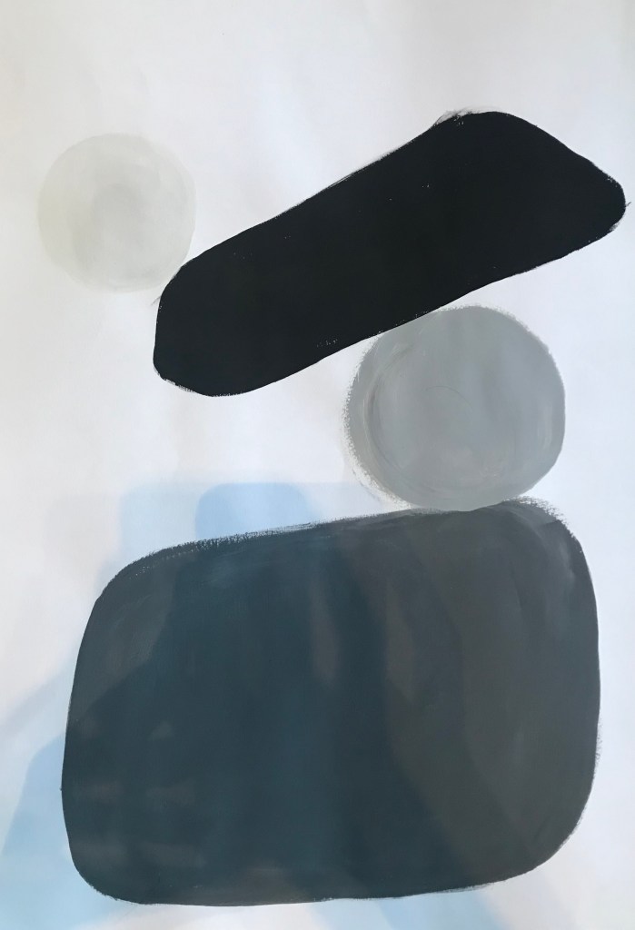
I started with small little study drawings of the rocks but simplifying them and only using white, black and grey. I really liked these pictures i think they are visually attractive and interesting. I then wanted to try this on a bigger scale. I really wanted to4 look at composition and create the illusion that the shapes are balancing voraciously on top of each other but in 2D with no tone. Using acrylic paint i painted shapes like circles, ovals and rounded edged cubes and tried to create the feel of balance. I used the three colours as i wanted the tones to all go together with non of them over powering the others. I also wanted the pieces to be simple so didn’t want to hae any distracting colours. The combination of the straight and rounded edges in the piece creates a contrast however still remain balance. I think these pictures are great examples that balance and contrast work hand in hand and have a piece of at with has a strong scenes of contrast and balance is very pleasing to the eye.