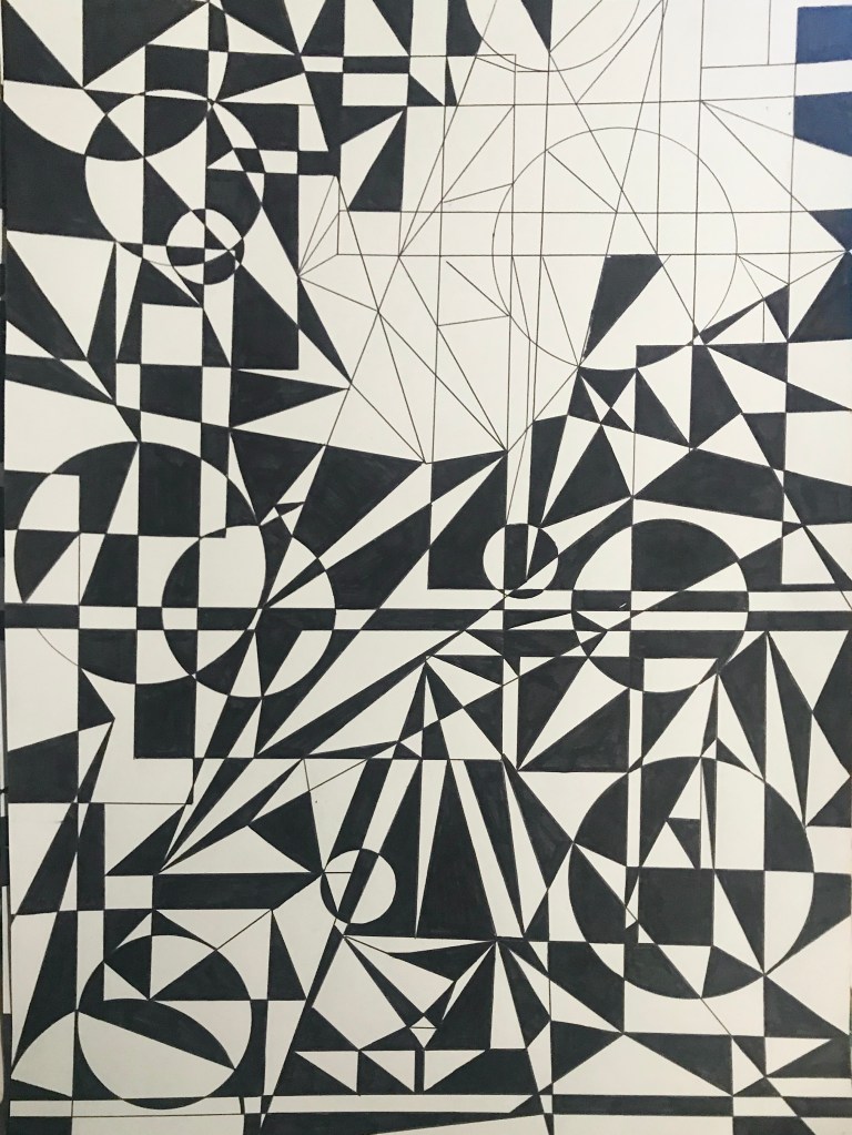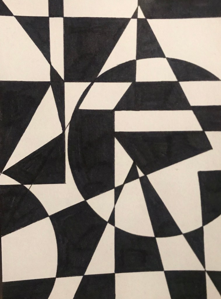
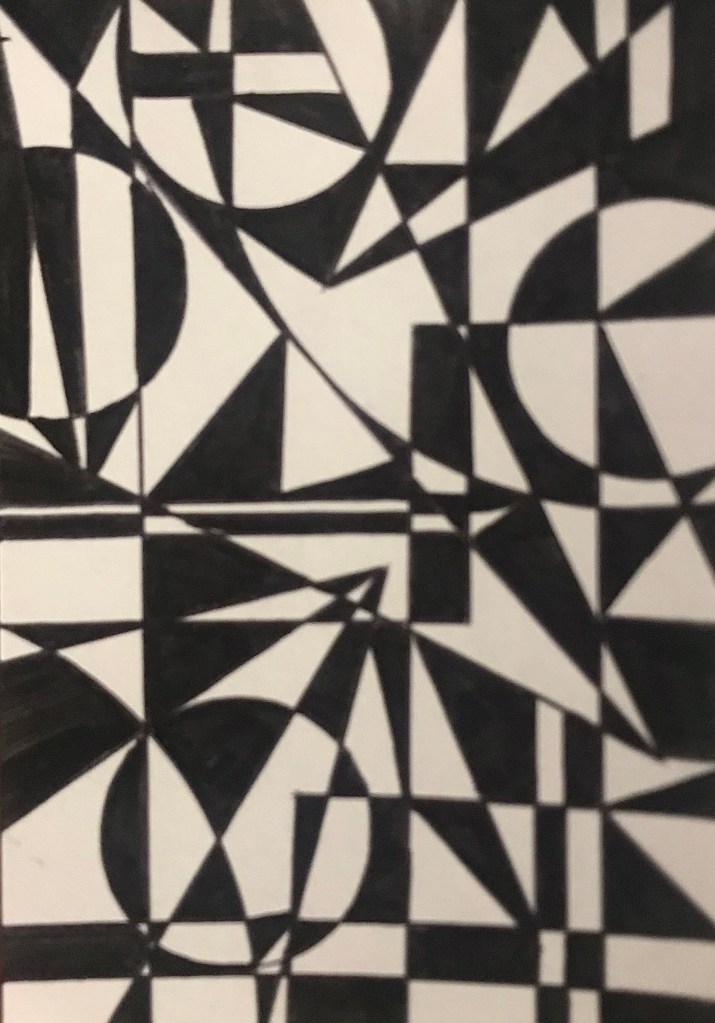
Taking inspiriting from the ying yang i really wanted to get started in creating pieces of art with has a strong contrast focusing on two clashing sides. I wanted to create pieces which were very bold from the use of geometric shapes and a monochrome colour palette. I started by doing small little sketches of interlocking shapes like, triangles, circles and squares. I wanted to use a mixture of shapes with rounded corners and rounded edges to add another element of contrast in my pieces. I started to fill in the opposite shapes in the sketches which created a really interesting look which i really liked and wanted to develop further on a bigger scale and small complex designs.
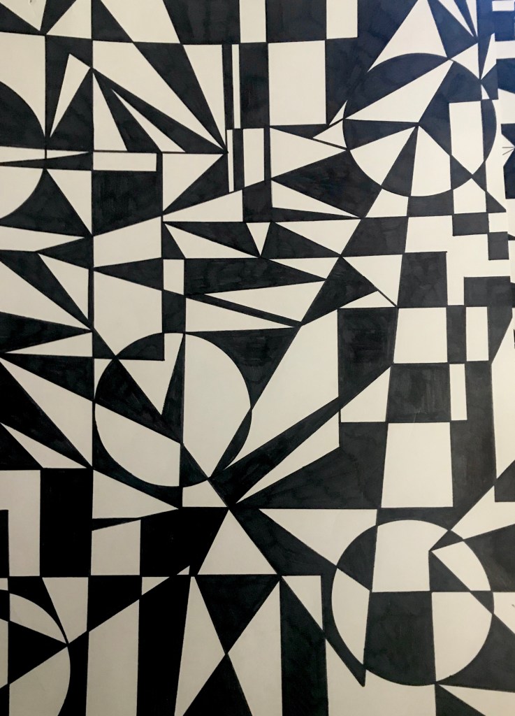
I tried out different composition exploring symmetrical designs along side pieces with a juxapositioning. The symmetrical designs look more technical i think. They look really thought out and controlled however due to the chaotic colours and use of shape the look messy. I really like that controlled mess look as i think it adds character to the pieces.
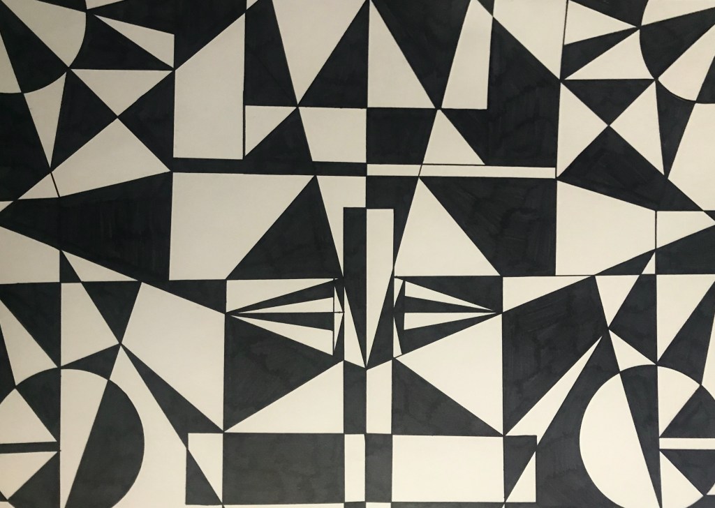
Due to the complex details and only two colours the pieces are quite hard to look at. You are drawn in because they are visually interesting however after a while they start to hurt your head. I think only using black and white helps as i wanted there to be a balance in the colours with them not fighting against each other. Only having to colours almost helps as because the composition and detail is so much i think the pictures would be crazy looking if i used lots of bight colours as you would be distracted by them which would take the affect from the shapes away. Finally only having the two colours represents the two contracting sides which is the point in the piece.
After my mid process brief my work was actually taken quite well, i think i have almost got stuck with the geometric theme looking at balance and contrast and i think it would be a good idea to step back and try and develop my theme in a different way.