Contrast is very important in art. It is one of the main principles in art. Contrast can be shown through shape and colour.
Colour contrast
When you think about contrasting colours the first thing you think about is blue and yellow and red and green. There is actually three kinds of colour contrast:
hue contrast
value contrast
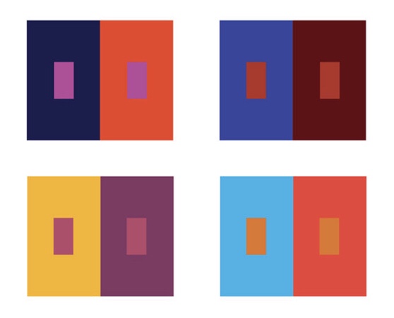
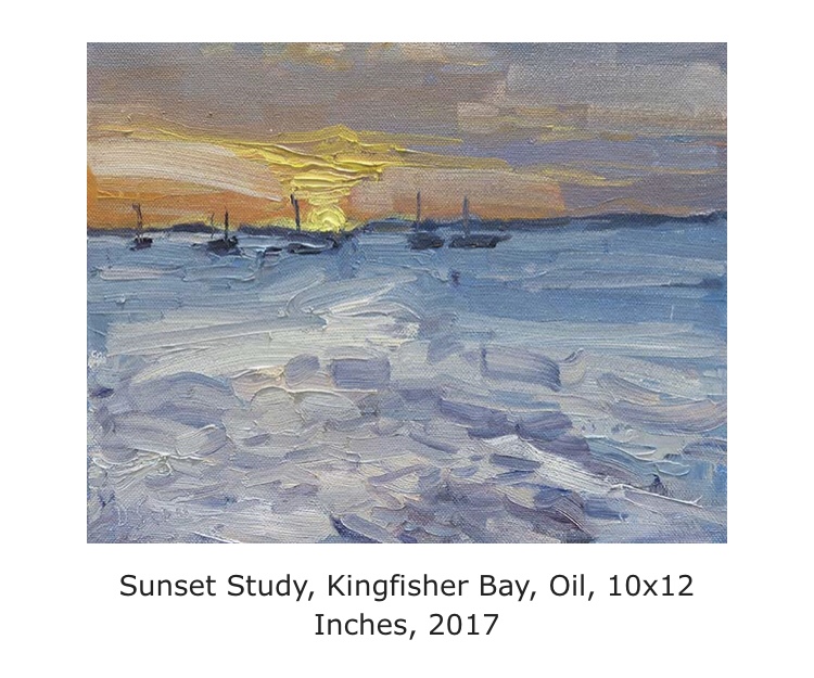
Saturation contrast
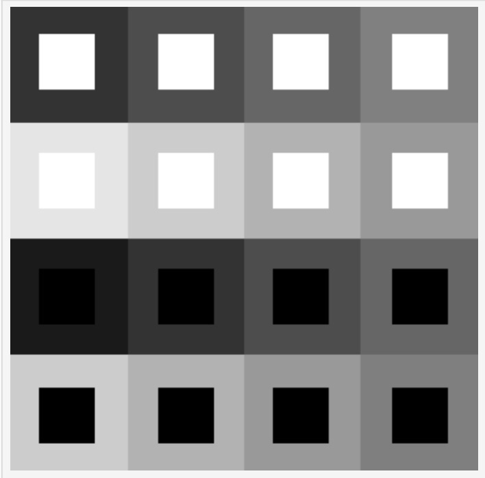
Value contrast
Value contrast refer to the contrast between light and dark. It is the relationship between the two opposites. Value contrast is about the amount of contrast between area of different values (light and dark) Value contrast is often seen in black and white photography or in monochromatic art. Value contrast is very effective, it allows you to focus o shape and the details. It also catches your eye due to the dramatic contrast.
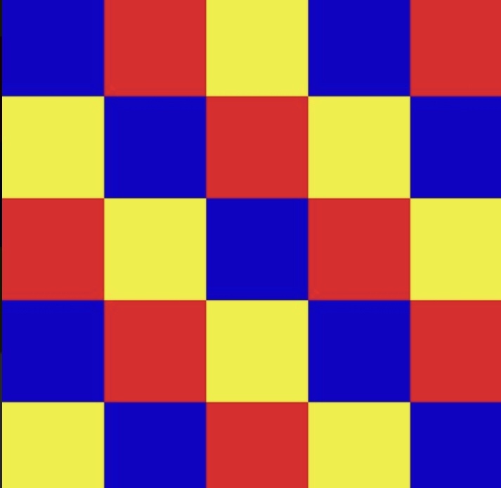
Hue contrast
Hue contrast refer to the contrast of colours on the colour wheel. Colours which are opposite to each other on the colour wheel like blue and yellow and purple and orange are used next to each other to create a strong contrast. Hue contrast is used in art if you want a certain object to standout from the painting or to catch your eye. Due to the bold contrast these objects pop out of the painting. Art which ha a strong use of hue contrast can be quite hard to look at as the colour don’t compliment each other and are really loud. The art work can be a fun feeling due to the bright clashing colours.
Saturation contrast
Saturated contrast refers to the saturation (how pigmented) the colours are compared to how dull they are. This is not a common contrast and isn’t often noticed however it can be really powerful in art. Saturation contrast can be see in a sun set painting for example. If the sun is painted in a bold yellow colour and i setting on white and grey snowy hills that would be a saturation contrast. The bright sun would contrast the snowy hills creating a beautiful peaceful scene.