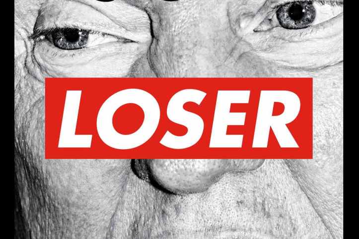
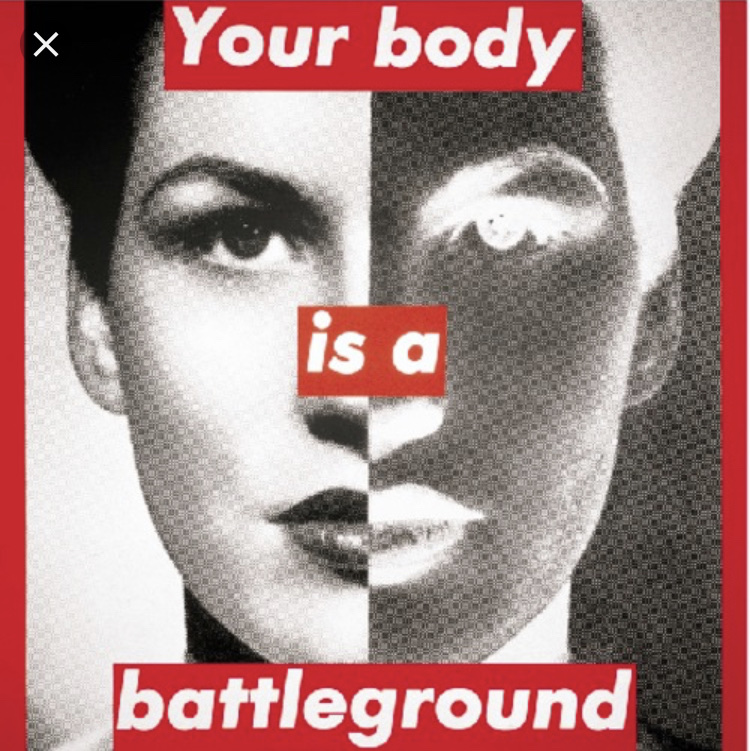
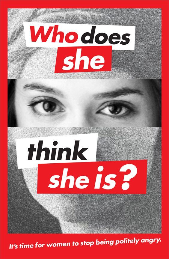
Barbra kruger was born on the 26th of January 1945 in new jersey. Kruger is known for her bold use white on red text overlaying a black and white image. Through bold headings and imagery Krugers work showed the themes of consumerism, power, sexuality and identity.

Kruger was born into a middle-class family, she studied at Syracuse University for one year however left due to the death of her father. Kruger then went on to study at Parson’s school of Design in New York in 1965. From then on Kruger found her passion for graphic design and picture editing while she was working as a graphic designer for magazines and freelance editing. Kruger’s talent was clear to see which led to her getting a design job at Condé Nast Publications and was soon awarded head designer. Kruger went on to do many more things such as; film, television, music and magazines

Kruger’s work is very powerful often focusing on themes like feminism, consumerism and sexuality. Kruger used monochromatic images from popular magazines and digitally overplayed them with big captions framing the images. Adding the text would often give the image a second meaning pointing out the areas in society no one talks about. Using text in her work shows how smart Kruger was combining text and photography to produce pieces of work which are crucial in art history. Through the use of colour Kruger’s work really stands out. It is her choice of colour palette which makes her work easy recognised, the use of black, white and red in her work inspired by the Constructivist Alexander Rodechenko really pops as the colours all clash which creates contrast within the pictures. Also using a reverse technique with white text on a red background makes the text cleared and easy to read. The text is bold, and, in your face, which is what Kruger wanted. She wanted her work to make point and to be seen by the public like almost a protest. Kruger’s work was often large scale, often printed onto billboards. This shows that Kruger’s work has a strong meaning and was meant to be make a difference. There is the element of shock because of the large size but also because of the bold text which was often; you, yours and I which engaged the viewers and makes it more personal.

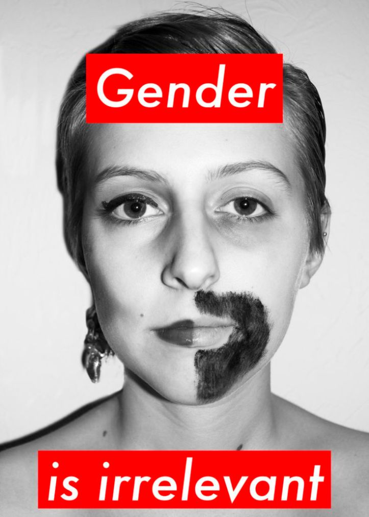
I took inspiration from Kruger’s work as I have got really into using text within my work as I found you can create something rally powerful and visually interesting just with captions and small pieces of text from magazines. I also have a very similar colour palate to Krueger as I really wanted a strong sense of contrast and clash in my work which I think links to Kruger’s. I was really inspired by how Kruger manged to focus on such big themes such as feminism and identity at that time where it wasn’t common for women to have such a political voice and really made a platform for herself, helping many people.

https://en.wikipedia.org/wiki/Barbara_Kruger