For the continuation of the “day today” brief we had to choose one or more of our pieces of art from the first part of the brief and continue to develop and resolve it.
For part two I chose to continue my work from “forecast” and combining the theme and shapes from “division” I was really happy with the way my pieces came out for “forecast” and wanted to see how I could develop my work and try and push myself be more loose and abstract with it. I also wanted to develop the themes and geometric shapes from” division” as I think it has a lot of tension and emotion in it which I wanted to explore a little deeper. I also wanted to play around with the contrast with in the two styles of art I produced from the two days as I think I took a very different spin on each day from being very tight and geometric for “division” and being loose and experimental for “forecast”.
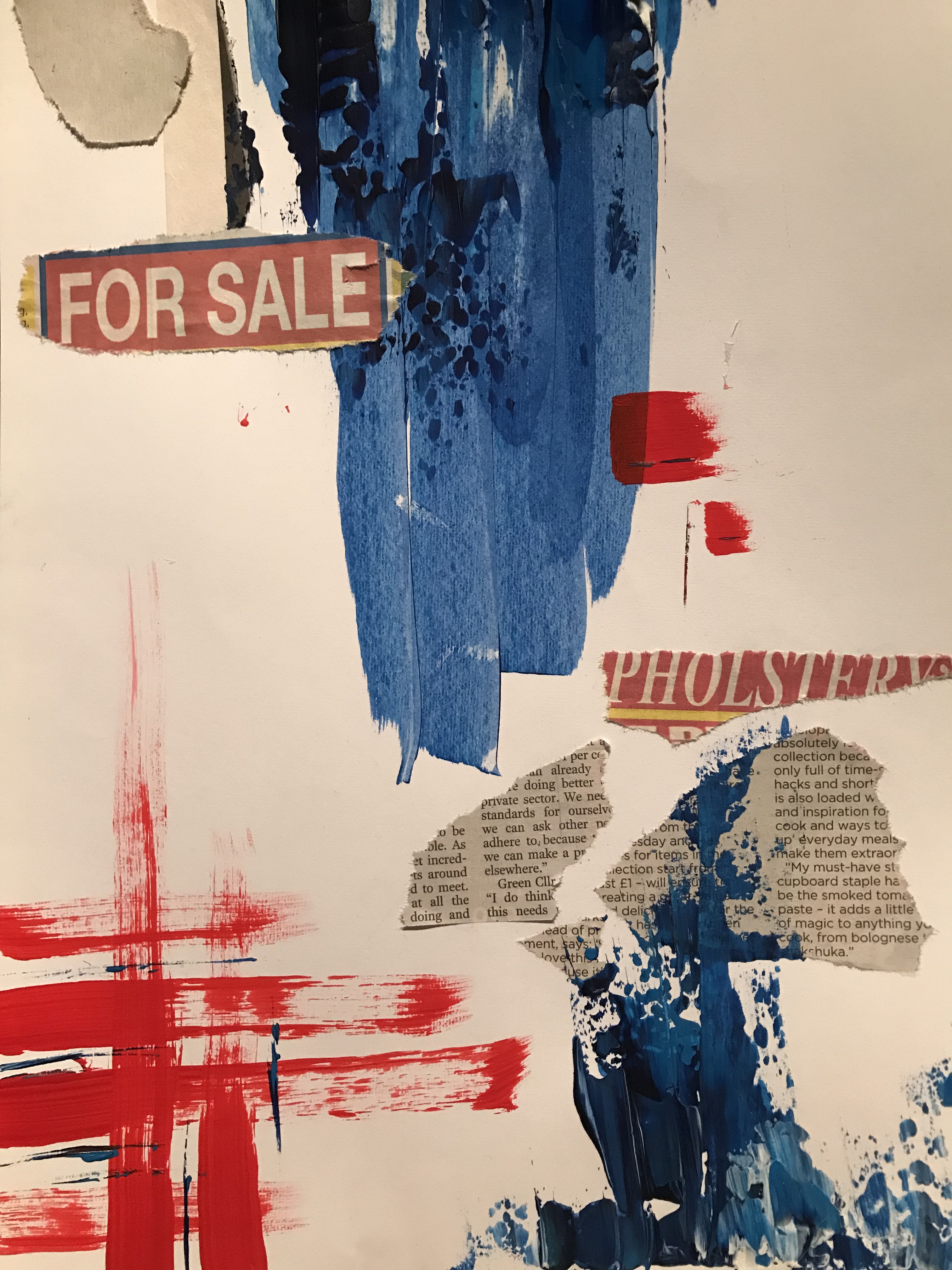
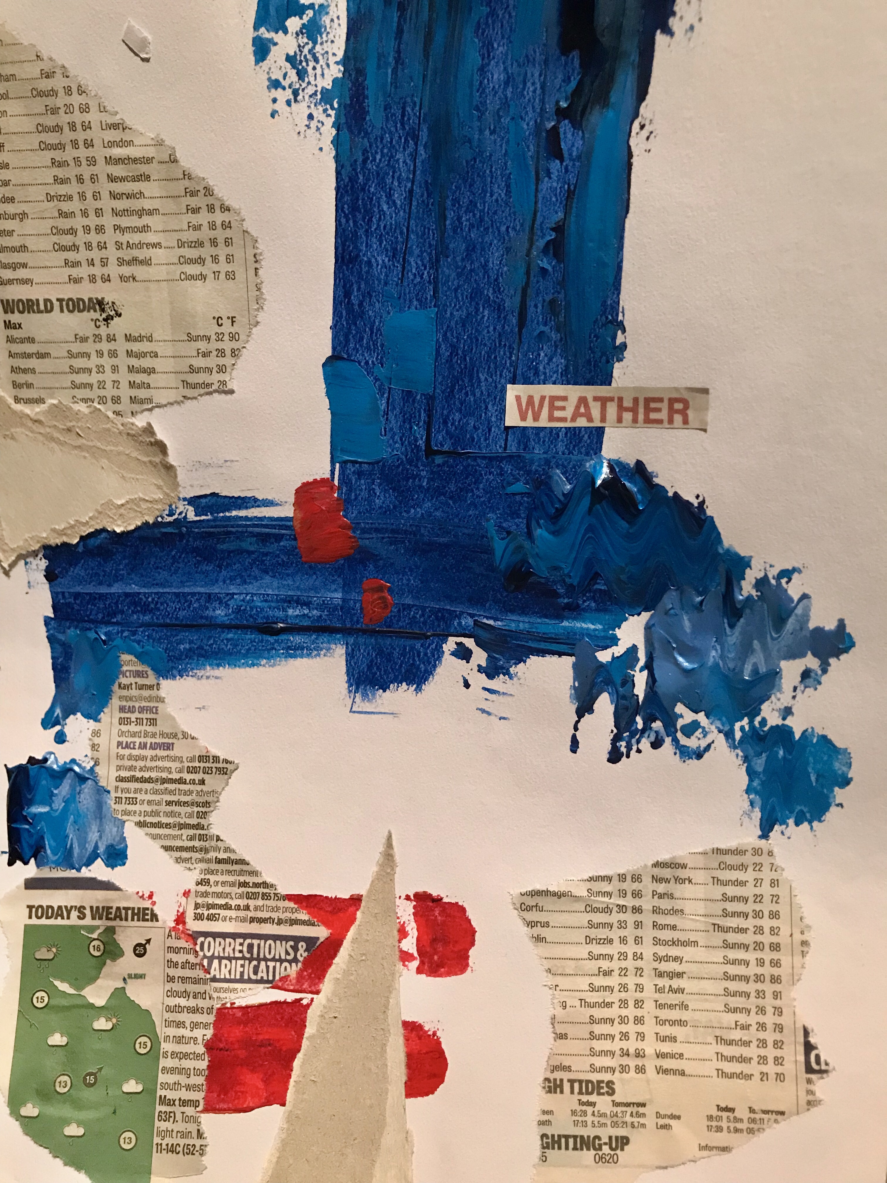
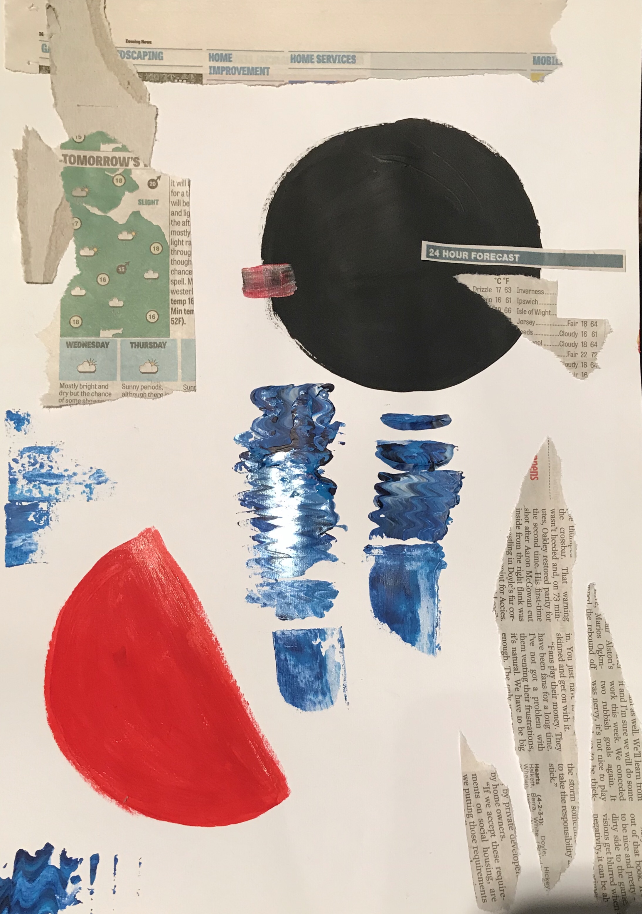
I explored combining the two significant colours from the two days, the blue and the red. I wanted there to be a bold and dramatic clash in the colours in the art as I wanted to show the theme of disagreement. I wanted the colours to clash to symbolise the different opinions people have about the same sex toilets from the article but also in life. I wanted the colours of bounce of each other which links to the issue of things never being resolved as people can’t put their opinions to at side. I wanted to show the contrast within the pieces using shape, I used the round circles alongside the sharp rectangles and ripped edges as I wanted to show the contrast and how they clash of each other. I really liked the use of the newspaper collage so tried using the weather forecasts and maps in the paintings. I think this looks interesting ass it adds another element to the picture as it combines the natural tension within the weather and forecast and the man mad tension of sexism and disrespect. Looking back, using the forecast is maybe too literal as the article is about the return of the beast from the east but I am happy with the way it looks as it adds a bit of texture and text to the pieces.
I wanted to incorporate the theme of movement this in my work. I tried using the palette knife and squiggling It to create the effect of waves or ripples in the water. I really like this effect and think it really helps creates the feeling of movement which links to both articles as it link to the movement with in the forecast and the heavy winds but also the movement within politics for the same sex toilets and how things are slowing moving forward with in society.
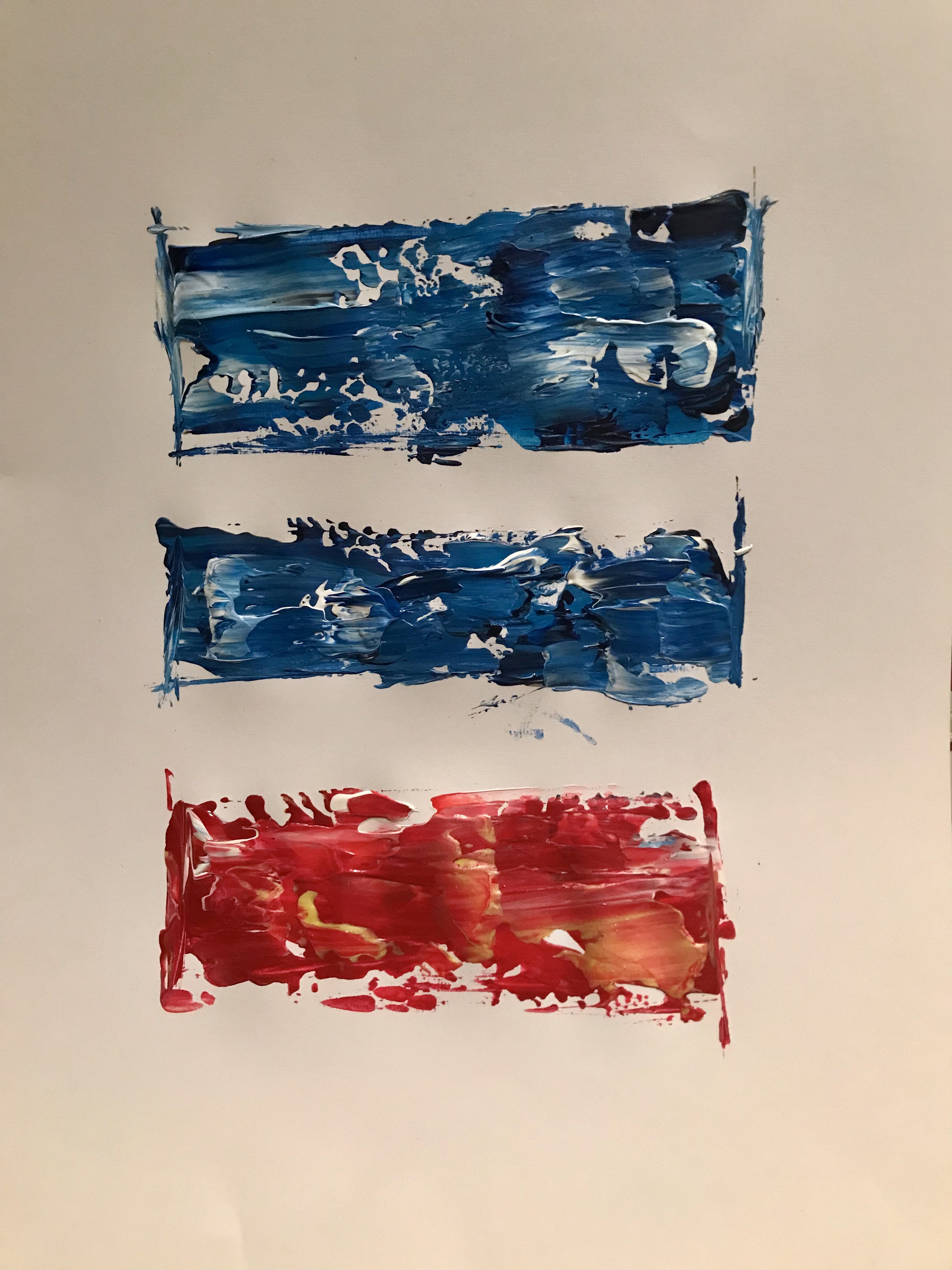
For my outcome I wanted my piece o to be very simplistic but very powerful. I chose to have three horizontal rectangles, two blue and one red. I chose to only use the rectangles as I wanted to use a very limited shape as I wanted to symbolise on how closed-minded people are with their opinions and refuse to see things in a different prospective. I wanted to have one rectangle red s I wanted to highlight the division with us I wanted to show that there I always an odd one out and we can either embrace it or shut it out. I chose to have three rectangles for two reasons. One, I wanted to symbolise the three genders: man, women and other. And I wanted to symbolise how there is always three ways of doing something. You can agree with someone, you can disagree with someone and you can compromise.
In reflection to the second half of the brief I am happy with what I have produced. I think I have explored interesting themes within my work and explored different techniques to produce some visually pleasing pieces. If I could change one thing, I would probably use range of materials. I think I limited my self and kind of got stuck using paint and collage over the week. I would experiment using sculpture as I think I could produce something interesting maybe using wood or paper showing the themes of disagreement and conflict but also movement .